Quidco expanded

Overview
We wanted to expand Quidco beyond the UK, but there was one tiny problem—the ‘quid’. We had previously expanded cashback into Germany, and we would update that site to the new pan-European cashback brand. So we embarked on a branding exercise with PS London. The new brand would require a new site which was an opportunity to start from scratch, to return to the basics, and to learn from all previous research and analysis.
My role on the project was two fold—first as the daily contact with the branding agency I worked directly and at times offsite; secondly I needed to define and document our existing end-to-end customer experience then define what would be the core or minimal product experience.
Other members of the design team were focused on projects for the existing site and mobile apps, however the whole team was involved in the research and defining phase. This would be a whole new cashback brand and a reset on both the functionality and front-end.
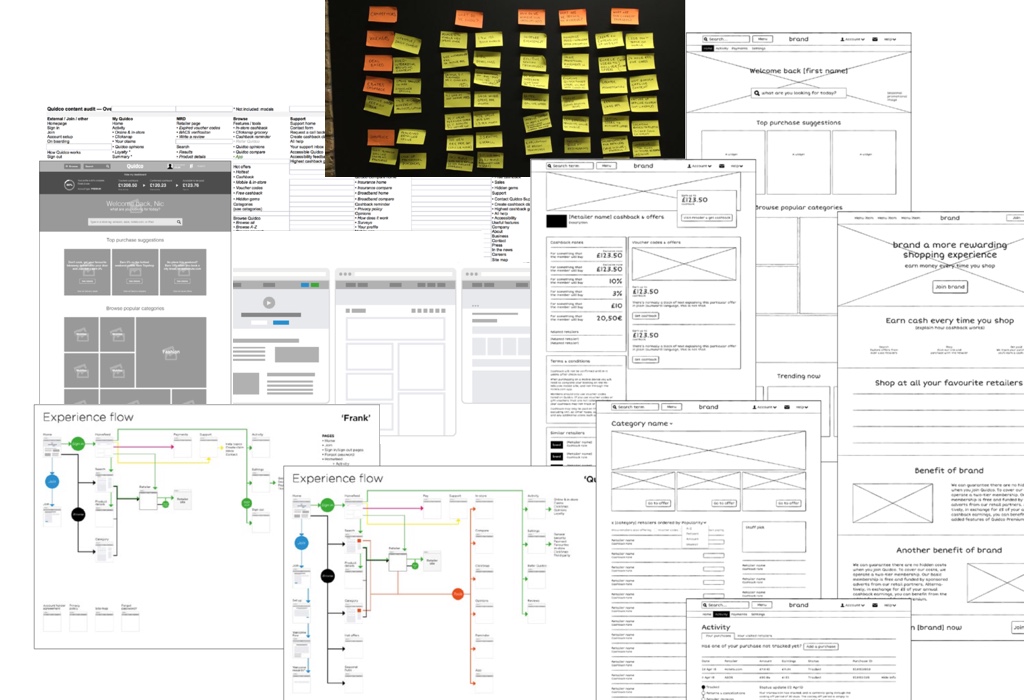
 The project wireframes and experience flow
The Process
The process began with research. The design team audited the current product & feature set. We also did an analysis of the all our previous user testing to identify all the customer needs and struggles. This allowed us to kickoff a mini-sprint jam session to card-sort those needs, and define the core cashback experience. We knew where we would focus our energies and which way our IA would be structured.
With our hierarchy in mind, I set about creating the new customer journey, sketch out wireframes for the major touchpoints, and begin documenting the core features. After a product team checkin, lo-fi wireframes were produced, followed by a few key templates for the branding agency to evolve—these would set out the rough structure and flows but not dictate the look & feel or the precisely wording (we wanted to see their fresh take on describing cashback rates and offers).
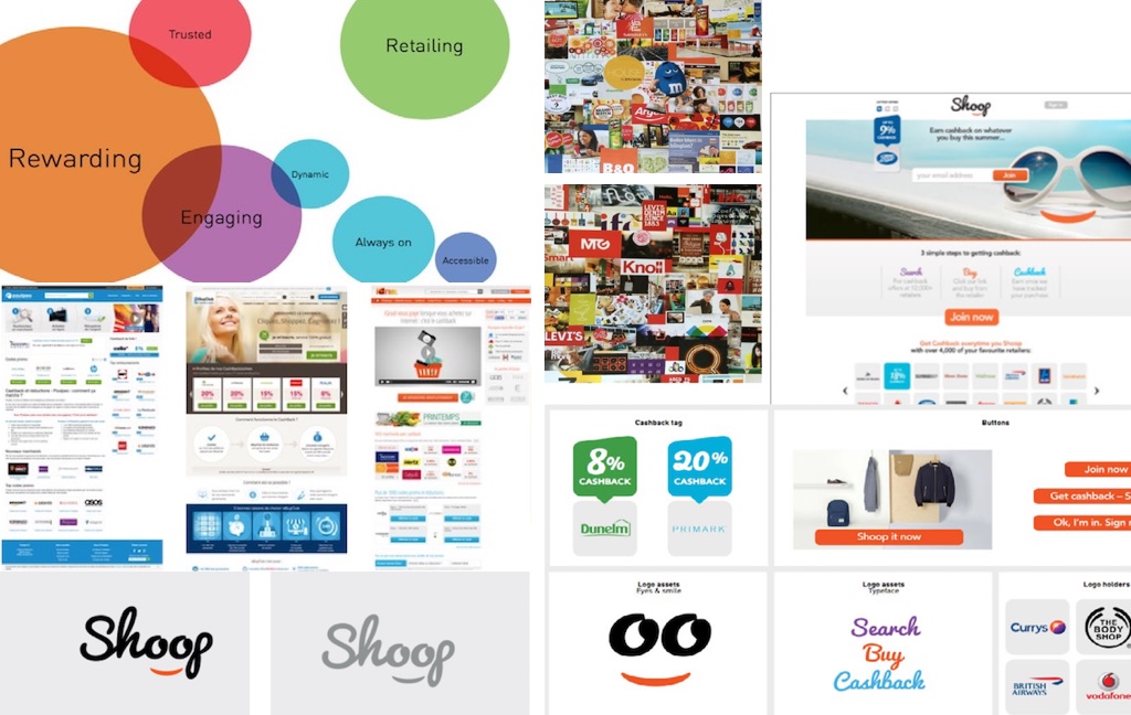
The agency had also begun their branding process and we went through the rounds of brainstorming, filtering and pitching the names to the management team and eventually the board. Feedback was taken and the agency returned to refine the list then work up a final choice. The final choice went through a round of feedback and ultimately to the direction that was rolled out.
For once we had some luxury of time and could count the design timeline in months instead of weeks.
 Research competition + First brand iteration: early direction produced by the branding agency
UX Solutions
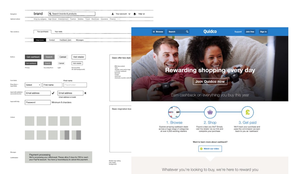
Our aim was to create a flexible structure for the eventual site, and give ourselves a lot of room to apply a cohesive and fresh UI. In documenting the core Quidco experience, early wireframes reduced pages to the basic content structure, with emphasis on zones that contained required but movable elements.
I built out a series of wireframe templates for the key areas of the product—home, feed, directory, retailer page, and account pages including transactions and payment. These were shared with the agency for their designers to apply brand options to the UI. The extra design capacity and outside experience provided by the agency allowed for some fresh perspectives away from the day-to-day projects.
Throughout this stage I continuously went back to the customer needs to validate if the solution met those needs. Once we had a working prototype, we began guerrilla testing to sense check we were achieving our goals, however this was done with an English prototype as we did not yet have the team online in France. It took another year to bring the German site over to the new brand, at which point I was no longer on the project.
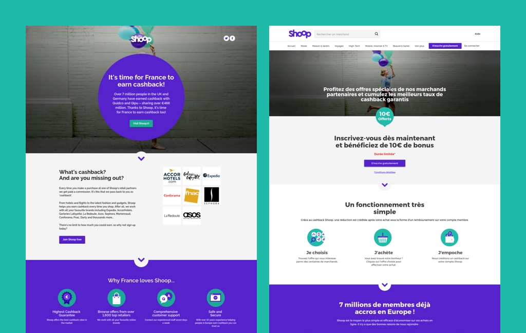
 Outcome: completed branding applied to live websites based on ux system