Canadian Tire mobile app
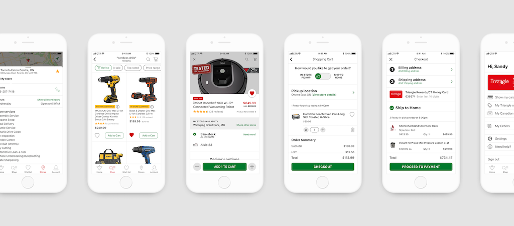
I brought design thinking to Canada's most beloved brand
When I started at the Canadian Tire Innovation Lab, I was soon brought onto a new app project which had already been started by the dev team. I found the team wanted to follow a sort of just-in-time waterfall—each week I was meant to deliver updated designs for a feature not yet built, and there was little time for design iterations. As designs were delivered in the grooming meetings, everyone had perfectly valid opinions on how the feature should work, but at that point we were all, myself included, making assumptions. We needed a better process that allowed collaboration before designs were started, and we needed to include the customer. Importantly the work we were doing was meant to be the foundation for the new Canadian Tire app.
The redesigned Canadian Tire mobile app launched in late September 2019. At launch we had raised the average App Store rating from under 3 stars to over 4.5 (as of November 2019). This was partly achieved through by our design process, not only changing how the teams worked together, but including the customer from start to finish.
The product, design & development teams collaborated using a series of modified design sprints. Every sprint started with customer painpoints and only ended when we had validated an idea through usability tests. The prcoess was fast, and some sacrifices were made, but we had only a few months. Owing to company culture, work could only begin when funding was approved, and with a history of working with external agencies, the design phase was typically two months. And because of the development process, all designs were expected after two months.
Working with the business analyst, project manager, lead developers, and product owner, we compromised on a semi-agile process. We would begin the 12 design sprints together, delivering each feature in the agreed sequence, and the dev team would start with the completed features. In five months we had 99% of the designs completed, and development steamed ahead for another seven months.
Project aims
Research led redesign with customer validation
Improve customer satisfaction with the app experience
Include first-class accessibility
My role
The redesign was a team effort. I contributed design strategy — setting the guiding principles and design language, building out the Sketch libraries, and working closely with the exceptional product designer we contracted to own the android experience. During the design sprints I contributed the iOS designs, taking features from wireframe to final mockups.
Impact
The new app raised the App Store rating from 3 to 4.7 stars
Customer feedback sentiment score greatly improved to positive
Design sprints still being used throughout Canadian Tire
The challenges
Current app: built on web-based technology, the app was difficult & costly to maintain. The app sought to deliver one consistent experience across all platforms with a single UI design, but this pleased neither iOS or android customers.
Time: the normal process gave Design two weeks to create the entire app. We had to throw out waterfall delivery and try to produce designs for each feature in sync with development sprints.
Collaboration: developers and product owners were eager to contribute ideas. Instead of late-stage reviews, we started as one team and used design sprints to define problems, find solutions and validate before delivery.

Guiding design principles
At the start I had to identify the overall UI and design language. The aim was to make the app feel like a natural native app on the customer's device. It would be simple, clean and modern, and would leverage the hard-proven UI patterns for each platform. There would be a fine balance required to ensure features were the same but platform specific.
After an accessibility review at WWDC, the lead iOS developer and I were also determined to ensure the app wasn't simple accessible but that it delivered an exceptional experience.
Platform specific experiences & best practises
Built with the upcoming Prairie design language (wide-open)
Accessibility with every sprint, not after

"Prairie"
The company wide digital design language was still undefined when we started, however we knew the overall direction that would evolve on the main canadiantire.ca website. Referring to the wide-open skies of the prairies, the design language aimed to remove clutter and focus on the product & important information. This also included giving the digital design air and calm where previously there was heavy dark colours and imposing backgrounds.
Prairie is modern, light, airy and content focused. On the app this meant avoiding heavy solid backgrounds and navigation headers, in giving content room to breathe and retaining only essential rules & borders to separate content. We also selected the brand green as a positive primary colour, and let the brand red shine where appropriate (sale tags, errors and warnings).
Research
I used a break before the project to begin gathering research necessary for understanding how customers used our app, and to identify the goals they were trying to achieve.
App Store reviews & in-app triggered feedback
Customer interviews & usability tests with existing app
Competitor analyses including Canadian, US and European retailers
I then worked with the product team to map the major painpoints against the app's core features. Each design sprint focused on a core feature, with the ideation session starting with reviewing the customer painpoints and examination of how competitors solved similar issues.
Validate, iterate and validate
We lived by an important rule with the design process, to test our solutions with real Canadian Tire customers. Therefore we validated our ideas with frequent usability tests and iterated until we had removed ambiguity. This meant we also rejected many approaches and wholesale features.
On at least two major features we used two sprints and were able to iterate on the product description page, cart and checkout. There were times when we did not have another sprint, and either tested an idea during another sprint, such as when we retested the browse functionality while testing search. At least one feature was removed and revisited after launch.
Each sprint started with identifiying the cause of a customer pain point, ideated solutions, converged the ideas, building out a design & prototyping based on our hypothesis that the solution solved the problem, then finally we tested the prototype.
One feature that fell outside our scope and team was the Sign in and Join process for the new Triangle single sign-on account. Another team built cross-platform prototypes which were tested separately, and delivered after our design phase had ended.
Our process
Our overall process unfolded in three phases:
Research and app definition
Design sprints
After sprint testing & feedback
Research and definition
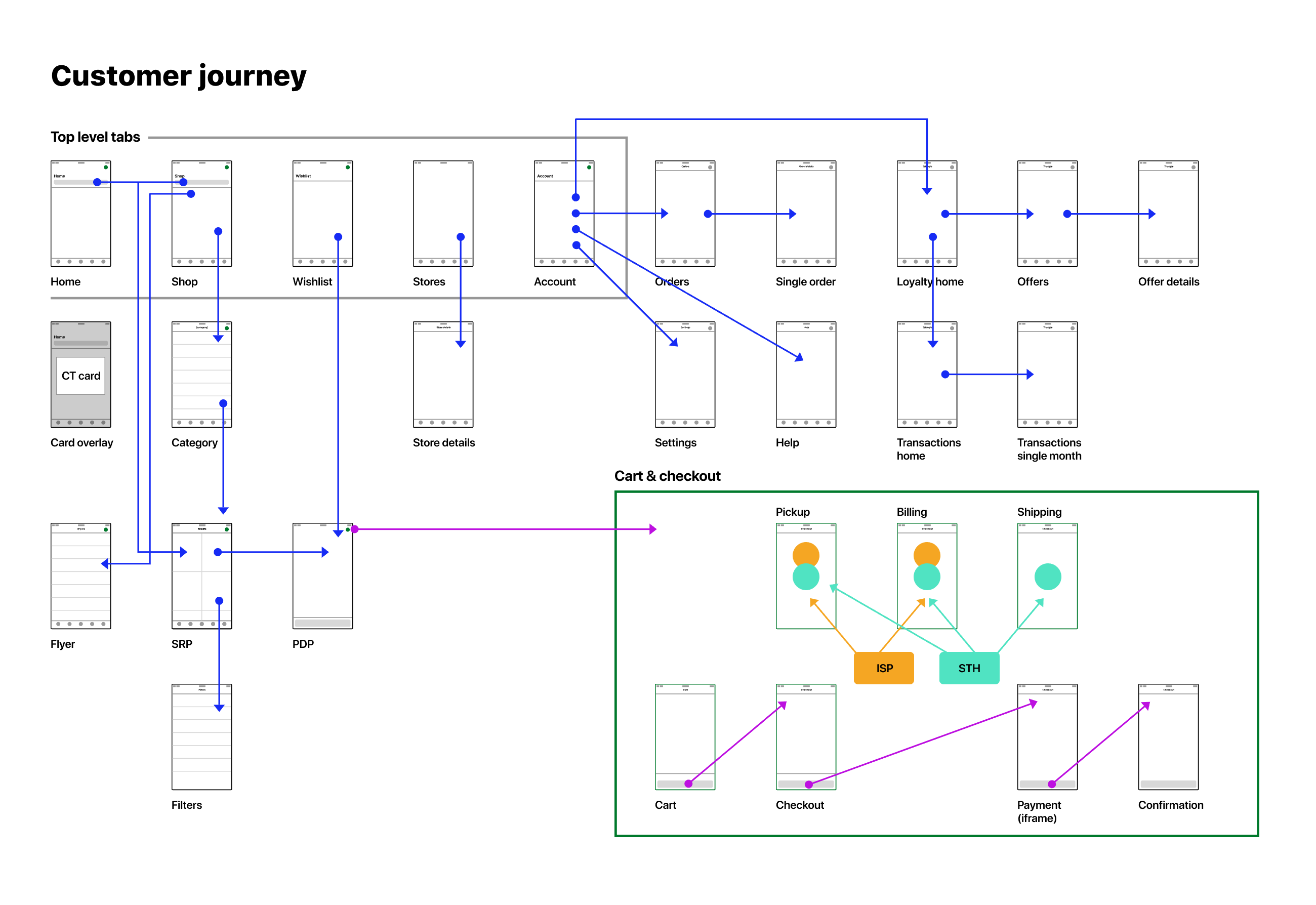
Before we began fully, we defined the product and laid out the design roadmap based on the sequence development would build. This was our customer's happy path and comprised the core features. We also defined the information architecture, and using rounds of interviews with card sorting, we determined our navigation structure.
I had seen in the customer feedback that iOS owners did not like the android style hamburger menu, therefore we returned tab navigation to the app. This might have been an example where to two apps diverged, instead we tested and implemented bottom navigation on android as well. Our first round of usability testing validated this navigation approach.
Design sprints
We used design sprints to enable better collaboration between all stakeholders and to ensure maximum opportunity for diverging ideas. We were also solving a timing issue which required the designs to be delivered for user story writing only weeks after the project began. With little lead time we would not have managed to complete the entire design, or have time for feedback. Our design sprints therefore fed the development sprints.
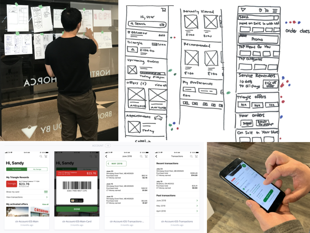
Each sprint began with a day featuring a presentation on competitive analysis, the framing of the problem (which were friction points surfaced in the user research), and running rounds of ideation sketching and dot voting. A final synthesis of the ideas would be sketched up to complete the day.
The next day or two would be focused on crafting high-fidelity wireframes of the idea and all state variations. The testing hypothesis would be written and the appropriate screens needed for the testing scenarios would be designed.
Finally the screens would be completed in InVision for the prototypes needed for usability testing. We built out the feature for both iOS and android, and when approaching test subjects, they would be given the prototype for their own preferred device. Results of our usability tests informed what further improvements would be needed, whether simple changes or new iterations that would be tested again.
After design testing & QA
Once all design sprints were complete, all final designs were delivered. As features were completed by the development team, the product team focused on providing adequate feedback to ensure all acceptance criteria were met. This feedback may have included adjustments to ensure the design was delivered as specified. We also took this time to perform further usability tests in the beta builds, including device specific interactions and accessibility.
UX solutions
Product description page
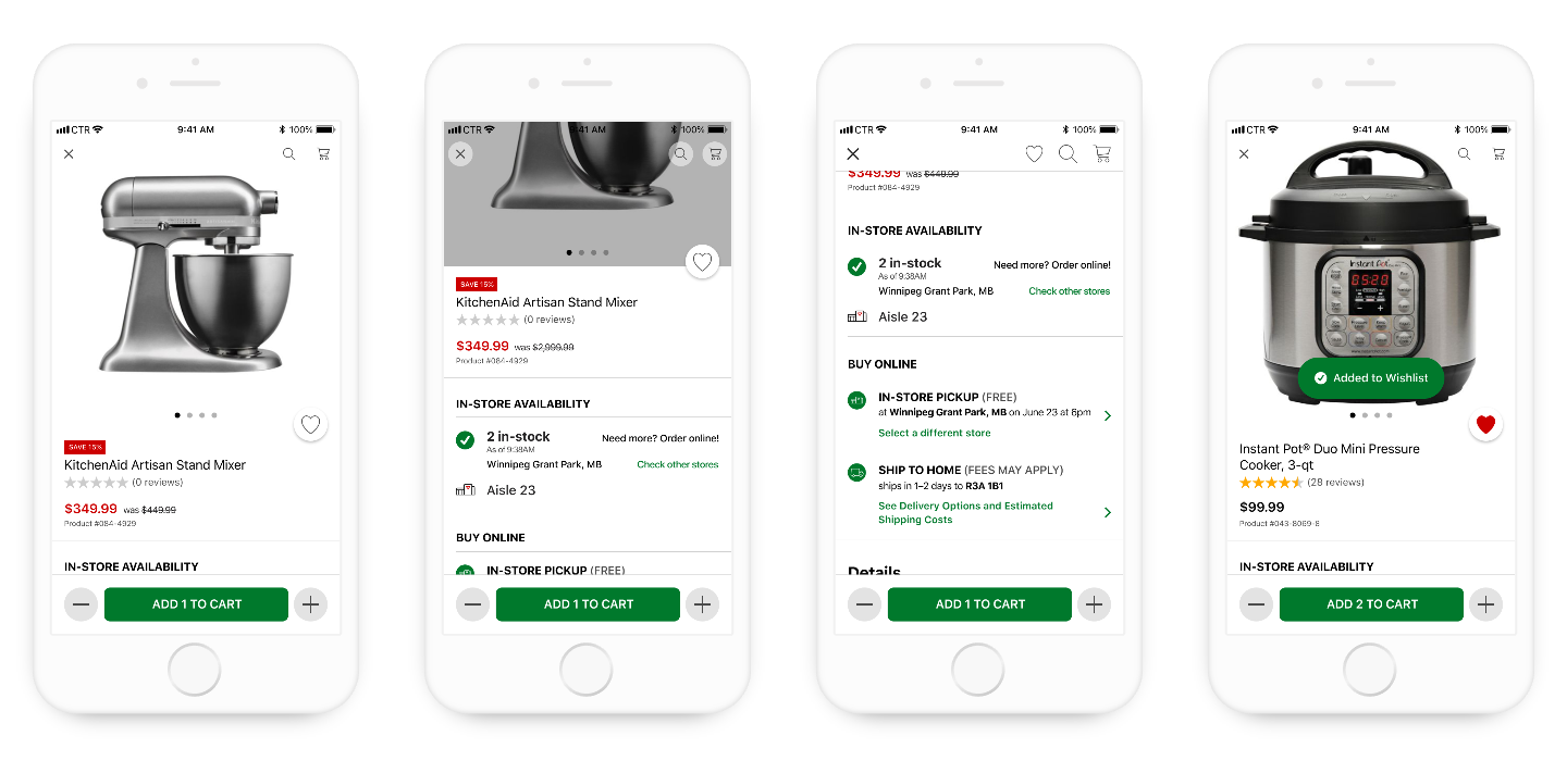
One of the most important views in the app, the product description page is an image rich interaction with individual products. It was one single view we iterated the most, with several rounds of usability testing to validate numerous interactions, including colour selection and adding multiple items to cart.
The previous app tried to include all key information on one screen without scrolling. This compromised shrunk the product photo and made the information hard to read. Customers complained they missed vital information and could not find the stock level indicator. To solve this we focused on a design with strong hierarchy of information for both product details and availability and used a scrollview.
Cart & checkout
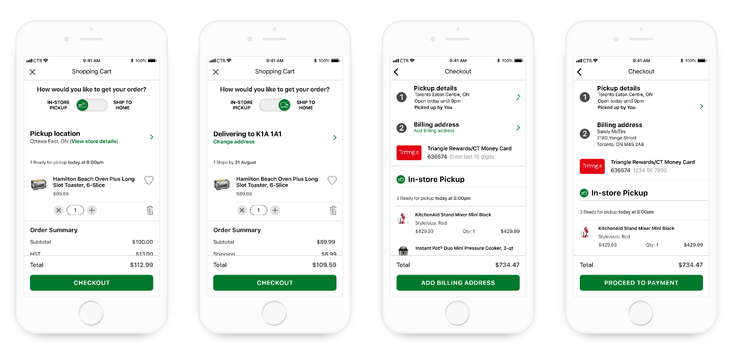
In the final two steps of the happy path, the cart & checkout work in tandem to enable efficient order completion. Throughout the shopping experience the customer would be presented with mutliple delivery options, with the cart containing the decision interaction. Aside from changing quantity (or saving an item for later), choosing between in-store pickup and ship to home is the primary decision before proceeding to checkout.
We needed to solve two problems with the Cart: the ability to switch from in-store pickup to the new home delivery, and confusing flow that customers struggled with. We included a toggle to switch the delivery method, and reduced the pain points.
Stores
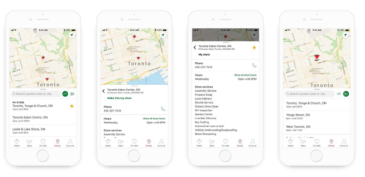
Another key feature identified in our research was the stores flow. Previously stores were an afterthought with a button added to the home screen, therefore stores were given their own tab, and a map rich experience. Taking clues from Apple apps using sheets (which became a key change in iOS 13), the interaction with individual stores stays contained in one view.
Etires
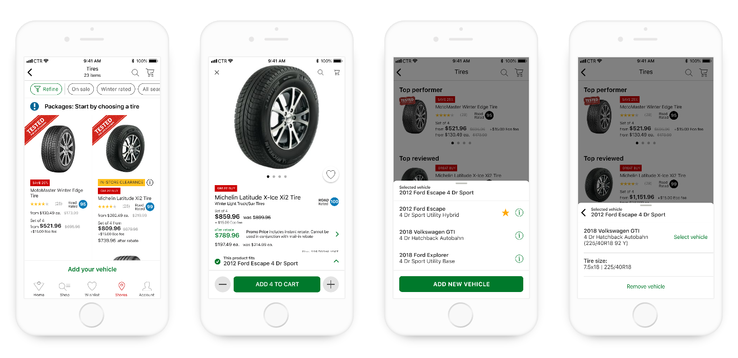
The Canadian Tire mobile app wouldn't be complete without a way to purchase tires. With its own sprint, Etires impacted most of the app experience, from search to the cart & checkout flow. Particular attention was paid to the product description page and the vehicle bar interaction.
The previous app did not include a bespoke Etires flow, and when we tested tire purchase with customers, they were unable to find the correct sizing for their vehicles. This often sent them to the website.
Conclusion
The app received generally favourable ratings, and raised the average App Store rating above 4.5 stars. Reviews were honest and identified popular features we had left out of the initial version. This helped realign the post-launch feature roadmap.