Work

Canadian Tire
I transformed mobile commerce through process change
Role
Sr. UX Designer
Sr. UX Designer
Timeline
2018–2019
2018–2019
Project overview
I led the complete redesign of Canadian Tire's flagship mobile app while fundamentally changing how the company approached product design development. I introduced and implemented a design sprint process, shifting the team from waterfall to iterative delivery.
I led the complete redesign of Canadian Tire's flagship mobile app while fundamentally changing how the company approached product design development. I introduced and implemented a design sprint process, shifting the team from waterfall to iterative delivery.
Problem
The mobile app needed to be replaced — built on an out-of-date web framework and lacking platform features including accessibility, it tried to unnsuccessfully to give an experience familar to both iPhone & Android. Typically outside agencies were contracted to deliever an entire app design in 6 weeks, and the development team expected all mockups before work could begin. There was no room for user testing or validation. This had to change.
The mobile app needed to be replaced — built on an out-of-date web framework and lacking platform features including accessibility, it tried to unnsuccessfully to give an experience familar to both iPhone & Android. Typically outside agencies were contracted to deliever an entire app design in 6 weeks, and the development team expected all mockups before work could begin. There was no room for user testing or validation. This had to change.
Impact
Changed organizational capability—design sprint process continues to be used. Delivered complete app redesign while maintaining rigorous user research and testing standards. Raised app's App Store rating to 4.8 from below 3-stars.
Changed organizational capability—design sprint process continues to be used. Delivered complete app redesign while maintaining rigorous user research and testing standards. Raised app's App Store rating to 4.8 from below 3-stars.
lululemon
I reduced e-commerce friction & drove revenue
Role
Sr. Product Designer
Sr. Product Designer
Timeline
2022–2023
2022–2023
Project overview
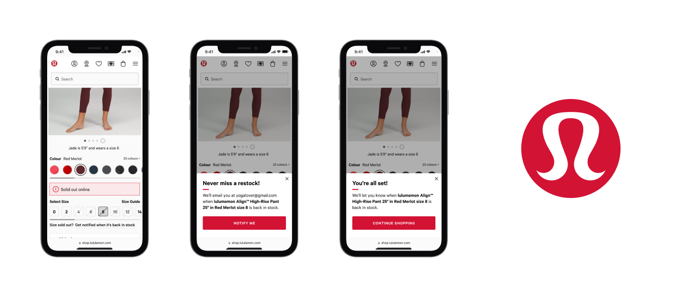
I designed the back-in-stock notification feature for lululemon's mobile app and website. Working with Product and UX research, I used the double-diamond process to take the competitivee user testing insights and foundational research to better define the core problem and constraints before crafting site-wide solutions that were narrowed down to a prototype for further usability testing, refined and delivered to the developers.
I designed the back-in-stock notification feature for lululemon's mobile app and website. Working with Product and UX research, I used the double-diamond process to take the competitivee user testing insights and foundational research to better define the core problem and constraints before crafting site-wide solutions that were narrowed down to a prototype for further usability testing, refined and delivered to the developers.
Problem
Captured in foundational research, guests couldn't purchase popular products as they are often out-of-stock , creating a dead-end shopping experience. Customers regularly called customer support asking when popular products would be back-in-stock.
Captured in foundational research, guests couldn't purchase popular products as they are often out-of-stock , creating a dead-end shopping experience. Customers regularly called customer support asking when popular products would be back-in-stock.
Impact
Partnered with Product to build tactical feature with broader retention strategy. Beat first year sales target months early, increased account engagement, and reactivated dormant accounts.
Partnered with Product to build tactical feature with broader retention strategy. Beat first year sales target months early, increased account engagement, and reactivated dormant accounts.
"I've been waiting all my life for this option from lulu thank f***in god"
— cinnamoncacao, reddit post
— cinnamoncacao, reddit post

Mountain Equipment Company
I built a research-led mobile commerce strategy
Role
Sr. UX/UI Designer
Sr. UX/UI Designer
Timeline
2023–2024
2023–2024
Project overview
I led comprehensive research initiative to understand customer mobile behavior and inform strategic investment decisions. Conducted customer interviews and behavioral studies to identify pain points and opportunities.
I led comprehensive research initiative to understand customer mobile behavior and inform strategic investment decisions. Conducted customer interviews and behavioral studies to identify pain points and opportunities.
Impact
Delivered evidence-based strategy and feature recommendations that influenced mobile product roadmap. Provided leadership with customer insights to guide multi-year mobile commerce decisions.
Delivered evidence-based strategy and feature recommendations that influenced mobile product roadmap. Provided leadership with customer insights to guide multi-year mobile commerce decisions.
BC Transit
I created a public transit digital experience strategy
Role
UX Specialist
UX Specialist
Timeline
2023
2023
Project overview
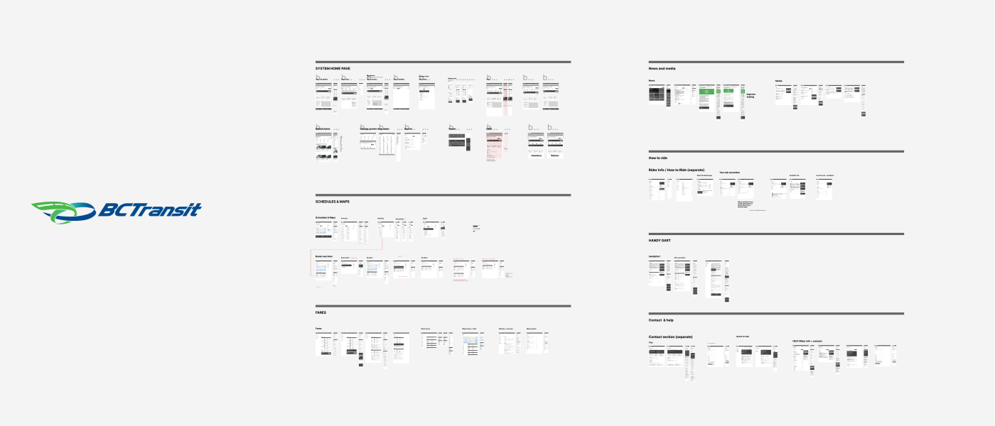
I created comprehensive design strategy to improve website experience and accessibility for provincial transit system. Compressed end-to-end project included research, user interviews, insights & pain-points, early concept low-fi wireframes, design system, phased roadmap recommendations. designer/developer hand-off. Presented recommendations to executive leadership and development partners.
I created comprehensive design strategy to improve website experience and accessibility for provincial transit system. Compressed end-to-end project included research, user interviews, insights & pain-points, early concept low-fi wireframes, design system, phased roadmap recommendations. designer/developer hand-off. Presented recommendations to executive leadership and development partners.
Impact
Delivered strategic roadmap as foundation for website redesign. Demonstrated ability to navigate public sector requirements while maintaining human-centred approach.
Delivered strategic roadmap as foundation for website redesign. Demonstrated ability to navigate public sector requirements while maintaining human-centred approach.

Refash fashion rewards
I designed a rewards platform with stickiness
Role
Product Designer
Product Designer
Timeline
2016–2017
2016–2017
Project overview
After 5+ years in the cashback industry leading the Quidco design and UX team, Refash was an opportunity to start from the beginning in building a rewards platform.
After 5+ years in the cashback industry leading the Quidco design and UX team, Refash was an opportunity to start from the beginning in building a rewards platform.
Problem
One problem we'd struggled to solve at Quidco was being front-of-mind for our members before they began shopping—we heard time and again, "I forgot to use Quidco".
One problem we'd struggled to solve at Quidco was being front-of-mind for our members before they began shopping—we heard time and again, "I forgot to use Quidco".
Impact
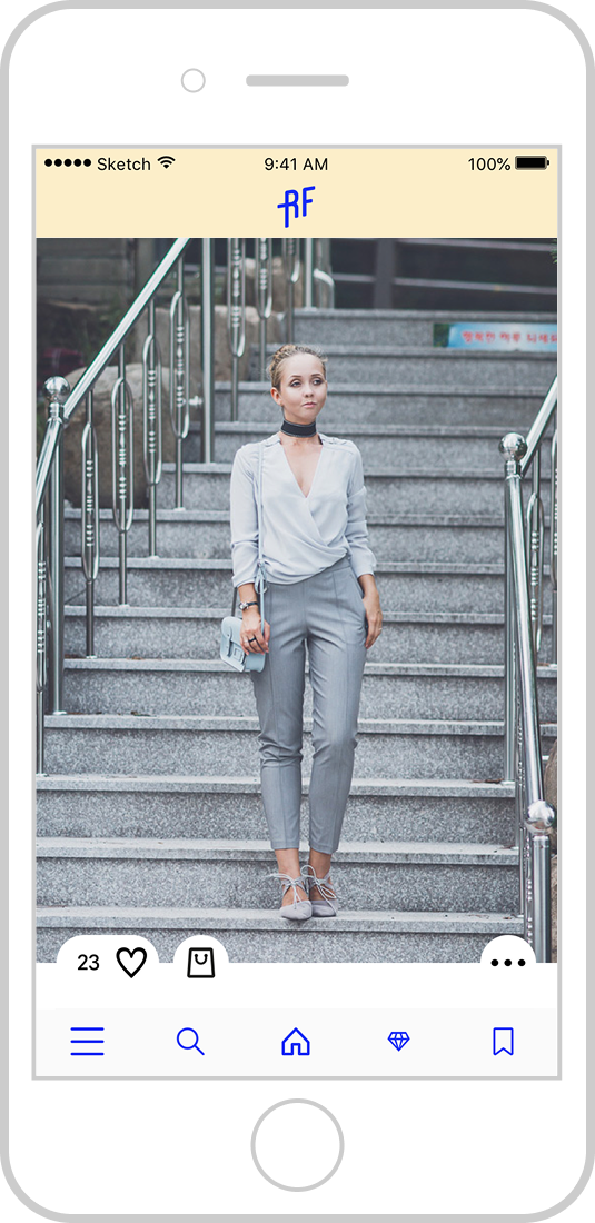
We made two decisions early in our process—we used lean user research to frame the rewards mechanics, and we used Theory of change to identify a shortcoming with customer understanding so we could build a map to changing consumer habits. The result was a fashion inspiration app which rewarded customer's purchases through the platform. Leveraging buyable looks within Instagram (before their own buy button), we reached out to fashion influencers to share looks tagged with products. This solved two problems existing with Instagram fashion posts—the inability to purchase items in a look, and creating a product customers would return to more frequently.
We made two decisions early in our process—we used lean user research to frame the rewards mechanics, and we used Theory of change to identify a shortcoming with customer understanding so we could build a map to changing consumer habits. The result was a fashion inspiration app which rewarded customer's purchases through the platform. Leveraging buyable looks within Instagram (before their own buy button), we reached out to fashion influencers to share looks tagged with products. This solved two problems existing with Instagram fashion posts—the inability to purchase items in a look, and creating a product customers would return to more frequently.
Wareable
I created the brand and editorial design for a new media outlet
Role
Editorial & brand Designer
Editorial & brand Designer
Timeline
2015–2017
2015–2017
Project overview
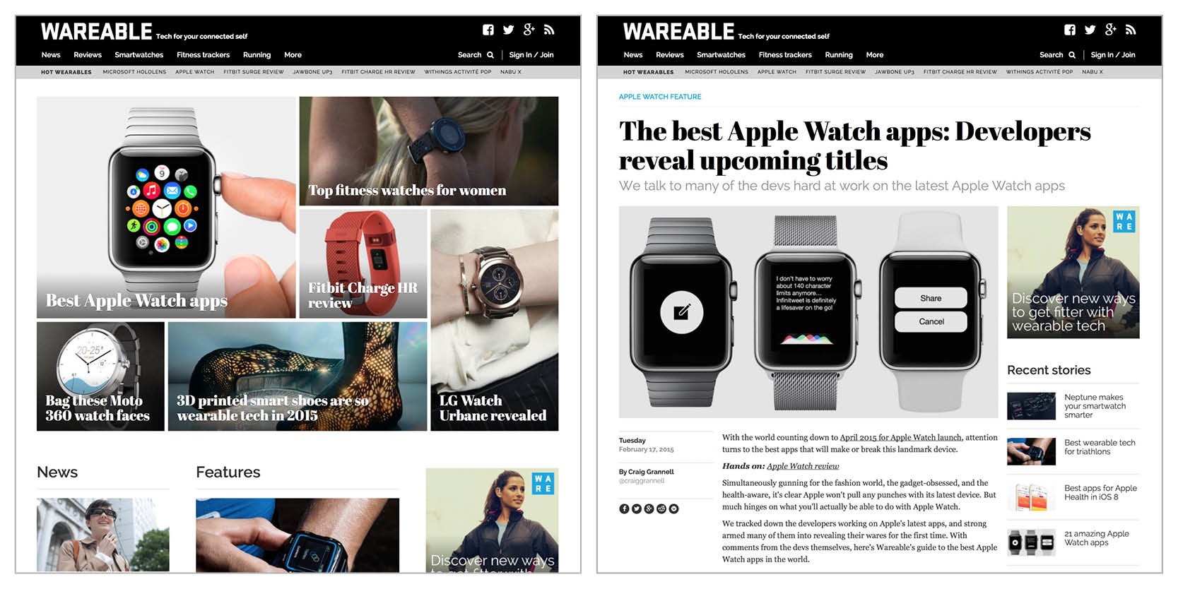
A product of Tipping Canoe, Wareable was a brand new content-based site devoted to 'tech for your connected self'. Launched in 2015 with the initial design, I worked on addition design projects and site additions until 2017. The initial design was a one-month project focused on establishing the design & branding through a series of iterations with the site cofounders.
A product of Tipping Canoe, Wareable was a brand new content-based site devoted to 'tech for your connected self'. Launched in 2015 with the initial design, I worked on addition design projects and site additions until 2017. The initial design was a one-month project focused on establishing the design & branding through a series of iterations with the site cofounders.
Impact
Wareable became the authority for wearable/connected tech thanks to the editorial team. The brand continues to exist post-acquistion and the site design has changed only slightly as of 2026.
Wareable became the authority for wearable/connected tech thanks to the editorial team. The brand continues to exist post-acquistion and the site design has changed only slightly as of 2026.
Quidco loyalty platform
I led the design of the UK's number 1 cashback platform
Role
UX designer ⟶ Sr UX & brand designer (Head of Design)
UX designer ⟶ Sr UX & brand designer (Head of Design)
Timeline
2010–2015
2010–2015
Project overview
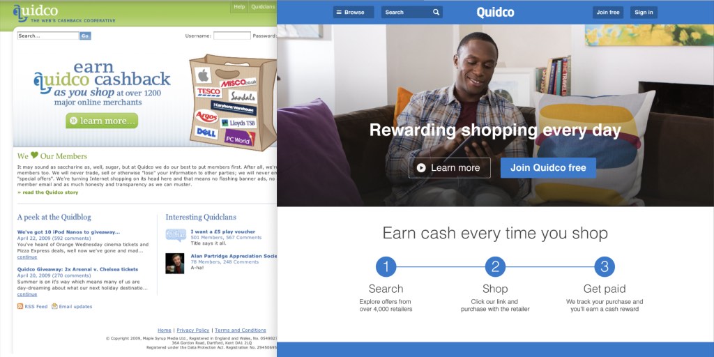
Originally created by Tipping Canoe, Quidco quickly transformed the UK cashback market with its 100% cashback co-op model. I worked on Quidco through Tipping Canoe before becoming the full-time in-house designer based in London. Over the 6 years at Quidco, I designed numerous features, redesigns, advertising campaigns and mobile apps. In 2012, I began building a larger UX team which I led until 2015.
Originally created by Tipping Canoe, Quidco quickly transformed the UK cashback market with its 100% cashback co-op model. I worked on Quidco through Tipping Canoe before becoming the full-time in-house designer based in London. Over the 6 years at Quidco, I designed numerous features, redesigns, advertising campaigns and mobile apps. In 2012, I began building a larger UX team which I led until 2015.
Impact
In 2010 Quidco had just 500,000 members using the single cashback product. We expanded the product offering and raised the membership to well-over 10 million. I introduced early design sprints in 2013 as a fast process for validating new ideas while greatly increasing collaboration and building internal empathy for our customers. Quidco was acquired in 2021.
In 2010 Quidco had just 500,000 members using the single cashback product. We expanded the product offering and raised the membership to well-over 10 million. I introduced early design sprints in 2013 as a fast process for validating new ideas while greatly increasing collaboration and building internal empathy for our customers. Quidco was acquired in 2021.
© 2026 Mike Barker